
Do you want to know what is data journalism?
Each journalist date possesses their own answer to this question. And there are many myths and misconceptions. Therefore, let us first push away from the opposite. Data journalism is not necessarily stories with big data or stories filled with numbers. Data journalism is not always infographics or something very complex.
Although, indeed, data journalism mostly consists of numbers and infographics, and even big data can even be used at times which can really be complicated, it is important to know that first and foremost data journalism is journalism that utilizes data.
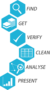
This is exactly what one of the most common definitions says: Data journalism is “collecting, cleaning, organizing, analyzing, visualizing and publishing data to create journalistic materials”. This definition lists the basic steps for creating a story date. First things first.
Stage number 1. Data collection
The first step in creating a story date is to collect data. But how do you understand what data needs to be collected? There are two options: either you initially have a question, the answer to which you seek to find in the data, or you get data in which you want to find interesting points.
Inspiration for the first method can come from anywhere. For example, from the agenda. You open a news site and read that they promise to build a new school in your city. You can turn this into a question, the answer to which can be found in the data. For example: how many schools are there in the city, how many students are there, and will one new school solve the problem of overcrowding? So, to answer these questions, you need to collect data on statistics of secondary school education.
Other times, the data finds its way to yourself. Suppose the Ministry of Education and Science has published data on the number of graduates of higher educational institutions in the country. Looking at this data, you may wonder: what professions are most graduated in the country? Is it a new trend or a stable situation from year to year? Is there a market for such professionals? You already have some of the data, but you may need additional data, for example, the number of vacancies by speciality.
Stage number 2. Data preparation and analysis
When you finally have collected all the data that is needed for the story, you are probably eager to start analyzing and processing it. But do not rush too much, otherwise you can make a lot of mistakes, which may result in restarting the work all over again.
The key, albeit the most labor-intensive, processes in date journalism are data cleaning and organization. Typically, this work is done in Microsoft Excel or other table processors. You can learn this online or at training courses on data processing. As a result, your data should become “clean”, that is, suitable for analysis using a computer.
How can a computer analyze data? First of all, these are simple mathematical operations, such as calculating the sum and average value, calculating a fraction or changing an indicator. The difference is that on a computer this can be done much faster than on a calculator, and perform these calculations with a huge number of indicators.
But the most important thing here is journalism; that is, how these calculations will help you answer questions for the story. For example, to find out how many students in your city have an average grade in one class, you need to add all the students in your city and divide by the sum of all classes.
In order to find out which class is the most crowded, you need to calculate the number of students in each class and sort these values from maximum to minimum.
The more complex the calculation, the more unexpected the story you can create. For example, using the methods of statistical analysis, you can establish a correlation or even the dependence of one indicator on another. Do the results of the national school test depend on how many students are in the class?
Stage number 3. Data communication
Now that you have completed your analysis and are ready to tell your audience about it, it is time to find the right words, images and characters for your story.
You do not need to write boring about data, all the mathematics can be leftovers by providing a link to your calculations. And in the story, itself, describe how what you found in the data manifests itself in life and what consequences it can lead to.
Think about what kind of experts and heroes you need to illustrate the problem that you want to raise in your material. Maybe your hero will be the boy who studied the worst in class until his parents transferred him to a less crowded school?
One way to tell your story is to visualize the data. At the same time, it is important to know the basic principles of design and be able to choose the right type of chart for what you want to convey to the audience. Classic charts, such as a bar chart for comparing data by category and a line chart for trending, never go out of style. And if you want to experiment, then there are many directories and online resources that will help you choose the type of chart you need.
There are also many online tools for creating visualizations, including free ones. Beginners are recommended to start with Datawrapper (the site has a blog with instructions), Infogram and, and advanced users should get acquainted with Flourish and Tableau.
Tips:
* do not be afraid of numbers
* organize work in stages, from idea to visualization
* read the news and try to turn the news item into a question, the answer to which can be found in the data
* read analytical reports and studies and try to understand this language
* learn the features of Microsoft Excel
* if you are new to data visualization, try starting with the “Datawrapper” service
If you have found a spelling error, please, notify us by selecting that text and pressing Ctrl+Enter.